


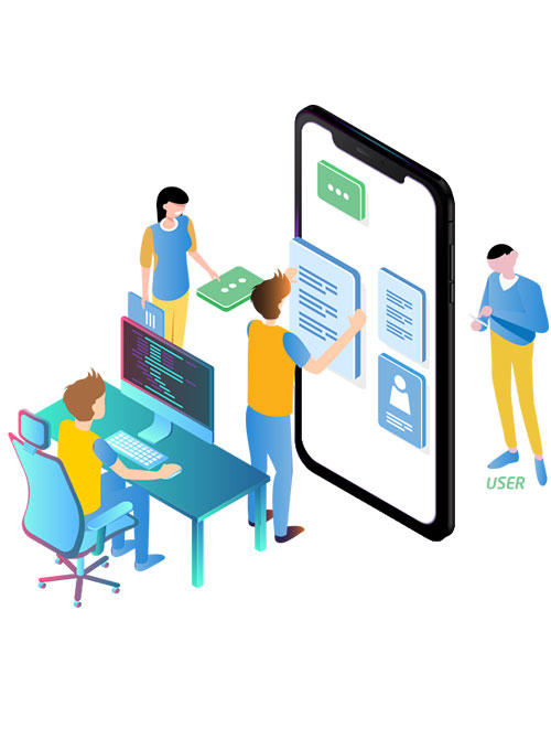
Whenever anyone has the first look at a new app, they immediately form an opinion about its appeal and look & feel. Principles of visual-design guide us how different design and visual elements – such as line, shape, color, grid, or space – work (or not) together to create appealing and thought-provoking visuals.
Why Understand Visual-Design Principles
- With better visuals in your designs and layouts, your app stands a chance to increase its usability.
- Following simple visual-design principles makes for a strong interactive design, increasing user engagement and success rate.
- Aesthetic things elicit positive emotions and a sense of delight and users even forgive minor functionality flaws.
- A strong brand needs to have appealing look and feel to host it. To strengthen your brand perception a strong visual design will help build user trust and interest.Also Read : Why You Should Go for Minimalistic UI Design While Building a Mobile App?
Principles and Elements of Strong Visual Design
- Scale: This principle refers to using relative sizes for different elements to signal relative importance in overall scheme. Most important elements in a layout (like titles) are bigger than the others. A good layout will have no more than 3 different font sizes because too much will create confusion. Bigger elements are perceived to be more important, but too many of them bring everything at the same level.
- Visual Hierarchy: A design layout with a good visual hierarchy will provide an easy flow of comprehension for your users. It controls the delivery of the experience and communication on your app. With a good hierarchy, designers guide the eye movement and bring the most relevant elements to the fore. Visual hierarchy can be easily incorporated in design by adding variations to scale, color, placement, etc.
- Balance: Balance is a very delicate to achieve, fragile to maintain but too important to ignore. It is a trade-off between two competing elements of design, just like color contrast. An optimal mix of differing design elements come together to create a harmonious artwork. Balance can be related to different screen spaces or simply about colors. Balance can be brought in by distributing elements symmetrically relative to vertical/horizontal axis, or even by creating asymmetry making the design dynamic and unconventional, or by placing them in a spiral manner relative to an imaginary central point.
- Contrast: Contrast means to the bring together almost opposites together to let them highlight themselves. The simplest example is use of dark (blue, black) colors on white paper for writing or typesetting for apps. With contrast, the eye can notice the difference in size, shape or color, between two or more objects. Bright colors of icons or bold text signify that they represent either the default options or more important options.
- Gestalt Principles: Gestalt Principles are similarity, continuation, closure, proximity, figure/ground, and symmetry & order. Proximity or closeness in UX can signify that items that are closer to each other are part of the same group. For example, the NBC logo, there is no peacock in the white space, but our brains perceive it to be there.
- Images: Visual is associated with photographs and illustrations. Images are important to any kind of app – for image sharing apps like Instagram the are the reason for their existence, for apps like eCommerce or cookery they are very essential, for even blogs or news websites they are very integral for the message. Size, presentation, borders, quality and layout of images on your app will leave lasting impression on your users.
- Typography: Typography refers to usage of artistic or simple fonts to present your text on the app or website. The fonts affect the reception of message by your users. Size and color are also important attributes that are to be considered for making them look nicely placed on the chosen background and around other elements.Also Read : Factors to design your mobile web typography
- Iconography: Icons are associated with actions and therefore must be relatable and easy to comprehend.Icons are for common actions and can literally replace a bunch of words. Strategically placed icons can provide the users easy access to various operations on the app and make their overall experience a smooth ride.
- Call-to-Action Links: Links and buttons for call-to-action are very important and serve a very clear purpose: to let the users initiate an action on the app or website. The action can be download, subscribe, share post, like or dislike a comment, sign-up for free trial, login for services, add to cart, make payment, etc. There number of actions is endless on a typical app. strategically placed Call-to-Action links and buttons can help you achieve your sales or active user targets.
Thanks for reading it.