
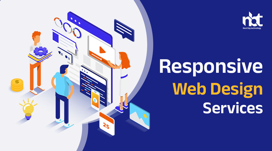
Table of Contents
Responsive Web Design Services
In today’s digital age, having a strong online presence is essential for businesses to succeed. With the increasing use of smartphones, tablets, and other mobile devices, it’s more important than ever to ensure that your website is accessible and user-friendly across all devices and screen sizes. This is where responsive web design services come into play. Responsive web design is a method of designing and developing websites that automatically adjust and adapt to different devices and screen sizes, providing users with an optimal viewing experience. In this article, we’ll explore the benefits of responsive web design services and how they can help enhance your online presence.
1. Improved User Experience: One of the primary benefits of responsive web design services is that they provide users with a seamless and consistent experience across all devices. Whether users are accessing your website on a desktop computer, smartphone, or tablet, responsive design ensures that the layout, content, and functionality remain consistent and easy to navigate.
2. Increased Mobile Traffic: With the growing number of mobile users, having a responsive website is crucial for attracting and retaining mobile traffic. Responsive web design services ensure that your website is optimized for mobile devices, making it easier for users to access your content and engage with your brand on the go.
3. Higher Search Engine Rankings: Search engines like Google prioritize mobile-friendly websites in their search results. By investing in responsive web design services, you can improve your website’s mobile-friendliness and increase your chances of ranking higher in search engine results pages (SERPs), leading to greater visibility and organic traffic.
4. Cost-Effectiveness: Responsive web design services offer a cost-effective solution for businesses looking to reach a wider audience across multiple devices. Rather than maintaining separate desktop and mobile versions of your website, responsive design allows you to maintain a single website that automatically adjusts to different devices, saving time and resources.
5. Faster Loading Times: Responsive web design services often result in faster loading times for websites, particularly on mobile devices. By optimizing the design and code for different screen sizes and devices, responsive websites load more quickly, providing users with a better overall experience and reducing bounce rates.
6. Easier Maintenance: Maintaining a single responsive website is much easier and more efficient than managing separate desktop and mobile versions. With responsive design, updates and changes can be made once and applied universally across all devices, ensuring consistency and reducing the risk of errors or discrepancies.
7. Future-Proofing: Responsive web design services help future-proof your website by ensuring that it remains adaptable and flexible as technology continues to evolve. With responsive design, your website can easily accommodate new devices, screen sizes, and technologies without the need for a complete redesign.
8. Enhanced Brand Reputation: A well-designed, responsive website reflects positively on your brand and enhances your reputation in the eyes of your audience. By providing users with a seamless and enjoyable browsing experience, responsive web design services help build trust and credibility, ultimately leading to increased customer satisfaction and loyalty.
How to Create a Responsive Web Design Services

In today’s digital age, having a responsive website is crucial for businesses to engage users across various devices and screen sizes. Responsive web design services play a vital role in ensuring that websites adapt seamlessly to different platforms, providing an optimal viewing experience for users. If you’re looking to create responsive web design services, here’s a comprehensive guide to help you get started.
Understanding Responsive Web Design: Responsive web design is an approach to web development that allows a website to adapt and respond to the user’s behavior and environment based on screen size, platform, and orientation. This ensures that the website looks and functions seamlessly across desktops, laptops, tablets, and smartphones.
1. Planning and Research: Before diving into the design process, it’s essential to conduct thorough planning and research. Identify your target audience, understand their browsing habits, and determine the devices and platforms they use. Conduct competitive analysis to understand industry trends and best practices in responsive web design.
2. Content Strategy: Develop a robust content strategy that takes into account the diverse needs of users across different devices. Prioritize content based on importance and relevance, and ensure that it remains accessible and readable on all screen sizes. Consider using techniques such as progressive disclosure to deliver content effectively.
3. Designing for Mobile-First: Adopt a mobile-first approach to web design, where you prioritize designing for mobile devices before scaling up to larger screens. Start by creating a simple, streamlined layout that focuses on essential content and functionality. This ensures that the website performs well on small screens and progressively enhances for larger devices.
4. Fluid Grid Layouts: Implement fluid grid layouts using CSS frameworks such as Bootstrap or Foundation. These frameworks allow you to create flexible grid systems that adjust automatically based on the screen size. Use percentage-based widths and max-width properties to ensure that elements scale proportionally across different devices.
5. Flexible Images and Media: Optimize images and media for responsive design by using techniques such as CSS media queries, srcset attribute, and responsive image breakpoints. Serve images at appropriate resolutions based on device capabilities to minimize load times and bandwidth usage. Consider using vector graphics and icon fonts for scalable, resolution-independent assets.
6. CSS Media Queries: Utilize CSS media queries to apply styles based on device characteristics such as screen width, orientation, and resolution. Define breakpoints to adjust layout, typography, and design elements for different screen sizes. Test and refine media queries across various devices to ensure a consistent user experience.
7. Testing and Optimization: Thoroughly test your responsive website across a range of devices, browsers, and screen sizes to identify and fix any issues. Use tools like Google’s Mobile-Friendly Test and BrowserStack to validate responsiveness and performance. Continuously monitor and optimize your website based on user feedback and analytics data.
8. Accessibility and Performance: Ensure that your responsive website is accessible to all users, including those with disabilities. Use semantic HTML, ARIA roles, and proper document structure to enhance accessibility. Optimize performance by minimizing HTTP requests, compressing assets, and leveraging browser caching to improve load times.
Why Should You Go for Responsive Web Design Services
In today’s digital landscape, having a responsive website has become more important than ever. With the increasing prevalence of smartphones, tablets, and other mobile devices, users expect seamless access to websites across all platforms. This is where responsive web design services come into play. Let’s explore why opting for responsive web design services is crucial for your business.
1. Enhanced User Experience: Responsive web design ensures that your website looks and functions flawlessly on any device, regardless of screen size or orientation. This seamless experience leads to higher user satisfaction, increased engagement, and longer time spent on your site.
2. Improved Accessibility: By adopting responsive web design, you make your website accessible to a broader audience, including users with disabilities. Responsive design ensures that content is readable and navigable, regardless of the device or assistive technology used by the visitor.
3. Better SEO Performance: Responsive websites tend to perform better in search engine rankings compared to non-responsive ones. Search engines like Google prioritize mobile-friendly websites in their search results, leading to increased visibility and organic traffic for your site.
4. Cost-Effectiveness: Investing in responsive web design services eliminates the need for separate desktop and mobile versions of your website. This reduces development and maintenance costs, as you only need to manage one website that adapts to different devices seamlessly.
5. Increased Conversion Rates: A responsive website provides a consistent and intuitive user experience across all devices, which can lead to higher conversion rates. Whether users are browsing on their desktop, smartphone, or tablet, they can easily access your products, services, and calls to action, resulting in more conversions and sales.
6. Future-Proofing Your Website: As new devices with varying screen sizes and resolutions continue to emerge, responsive web design ensures that your website remains compatible and functional across all platforms. This future-proofing approach protects your investment and ensures that your website stays relevant in the long run.
7. Competitive Advantage: In today’s competitive digital landscape, having a responsive website sets you apart from competitors who may still be using outdated, non-responsive designs. A well-designed, responsive website demonstrates professionalism, credibility, and a commitment to providing an exceptional user experience.
8. Adaptability to Changing Trends: Responsive web design allows your website to adapt seamlessly to changing design trends, technology advancements, and user preferences. Whether it’s the adoption of new devices, screen sizes, or interaction patterns, a responsive website can easily accommodate these changes without requiring a complete redesign.
Market Prospects of Responsive Web Design Services and Platforms

In today’s digital era, where the majority of internet users access websites through a variety of devices, responsive web design has emerged as a critical component of successful online presence. With the ever-growing demand for websites that adapt seamlessly to different screen sizes and devices, the market prospects for responsive web design services and platforms are exceptionally promising. Let’s delve into the key factors driving the growth and potential of this dynamic market.
1. Rapid Growth of Mobile Internet Usage: The proliferation of smartphones and tablets has led to a significant shift in internet usage patterns, with more users accessing the web on mobile devices than ever before. As a result, businesses recognize the importance of catering to mobile users by investing in responsive web design to ensure optimal viewing experiences across all devices.
2. Search Engine Optimization (SEO) Imperatives: Search engines like Google prioritize mobile-friendly websites in their search rankings, making responsive design a crucial factor for improving SEO performance. Websites that are not mobile-friendly risk losing visibility and traffic, driving businesses to invest in responsive web design services to enhance their online visibility and reach.
3. User Experience (UX) Expectations: User experience plays a pivotal role in the success of websites, and responsive design is paramount for delivering seamless and intuitive experiences across devices. With users increasingly expecting consistent and user-friendly experiences regardless of the device they use, businesses are turning to responsive web design to meet these expectations and retain users.
4. Cost-Effectiveness and Efficiency: Responsive web design offers a cost-effective solution for businesses compared to maintaining separate desktop and mobile versions of their websites. By investing in responsive design, businesses can streamline development, maintenance, and updates, ultimately reducing costs and increasing operational efficiency.
5. E-Commerce Growth and Mobile Shopping Trends: The rise of e-commerce and mobile shopping has further fueled the demand for responsive web design. With a growing number of consumers making purchases on mobile devices, businesses in the e-commerce sector are leveraging responsive design to create seamless shopping experiences that drive conversions and sales.
6. Multi-Device Compatibility: Responsive web design enables websites to adapt to a wide range of devices, including smartphones, tablets, laptops, and desktop computers. This multi-device compatibility ensures that websites remain accessible and functional across diverse user environments, enhancing usability and engagement.
7. Future-Proofing Strategies: As technology continues to evolve and new devices enter the market, responsive web design offers a future-proofing strategy for businesses. By embracing responsive design, businesses can ensure that their websites remain adaptable and compatible with emerging devices and technologies, safeguarding their online presence and competitiveness.
8. Accessibility and Inclusivity: Responsive web design promotes accessibility and inclusivity by ensuring that websites are accessible to users of all abilities and devices. By implementing responsive design principles, businesses can reach a broader audience and create inclusive digital experiences that cater to diverse user needs.
Essential Features of a Responsive Web Design Services
In today’s digital age, where users access websites from a multitude of devices, responsive web design has become a necessity for businesses looking to provide seamless online experiences. Responsive web design services play a crucial role in ensuring that websites adapt and function flawlessly across various screen sizes and devices. Let’s explore the essential features that make up responsive web design services:
1. Fluid Layouts: Responsive web design services utilize fluid layouts that allow website elements to resize and reposition dynamically based on the user’s screen size. Fluid grids and flexible images ensure that content flows smoothly and maintains its proportions across different devices.
2. Media Queries: Media queries are a fundamental aspect of responsive web design, enabling websites to apply different styles based on the device’s characteristics, such as screen width, resolution, and orientation. By using media queries, responsive web design services ensure that websites adapt seamlessly to various devices and viewport sizes.
3. Flexible Images and Media: Responsive web design services optimize images and media to ensure they scale proportionally and maintain clarity across different devices. Techniques such as responsive images, scalable vector graphics (SVG), and adaptive streaming ensure that multimedia content looks crisp and loads quickly on all screens.
4. Mobile-First Approach: Responsive web design services often employ a mobile-first approach, where websites are designed and optimized for mobile devices first before scaling up to larger screens. This ensures that websites prioritize essential content and functionality, delivering an optimal user experience on smartphones and tablets.
5. Touch-Friendly Navigation: Responsive web design services incorporate touch-friendly navigation elements to accommodate touchscreen devices. Mobile-friendly menus, buttons, and gestures make it easy for users to navigate the website using their fingertips, enhancing usability on mobile devices.
6. Cross-Browser Compatibility: Responsive web design services ensure that websites render consistently across different web browsers and platforms. Thorough testing and compatibility checks ensure that websites function correctly on popular browsers such as Chrome, Firefox, Safari, and Edge, as well as older versions and mobile browsers.
7. Performance Optimization: Performance optimization is a key aspect of responsive web design services, ensuring that websites load quickly and efficiently on all devices. Techniques such as lazy loading, minification, and compression minimize load times and improve overall website performance, enhancing user experience and SEO rankings.
8. Accessibility Features: Responsive web design services prioritize accessibility, making websites inclusive and usable for all users, including those with disabilities. Semantic HTML, ARIA roles, and keyboard navigation ensure that websites are accessible to screen readers and assistive technologies, providing equal access to information for all users.
9. SEO Best Practices: Responsive web design services implement SEO best practices to ensure that websites rank well in search engine results. Mobile-friendly design, fast page speed, optimized content, and structured data markup improve website visibility and organic traffic, driving more users to the site.
Advanced Features of a Responsive Web Design Services

In the rapidly evolving landscape of web design, staying ahead of the curve requires embracing advanced features and techniques that enhance user experience and adaptability across diverse devices. Responsive web design services play a pivotal role in achieving this goal by incorporating advanced features that go beyond the basics. Let’s delve into the advanced features of responsive web design services that elevate websites to new heights:
1. Device-Agnostic Design: Responsive web design services implement device-agnostic design principles, focusing on creating layouts and experiences that transcend specific devices. By prioritizing content hierarchy, usability, and flexibility, device-agnostic designs ensure consistent and optimal experiences across all devices, regardless of screen size or platform.
2. Progressive Web Apps (PWAs): Responsive web design services leverage progressive web app (PWA) technology to create web experiences that mimic native mobile applications. PWAs offer features such as offline access, push notifications, and home screen installation, providing users with a seamless and app-like experience on both desktop and mobile devices.
3. Dynamic Content Loading: To optimize performance and user experience, responsive web design services implement dynamic content loading techniques such as lazy loading and infinite scrolling. By loading content asynchronously as users scroll or interact with the website, dynamic content loading minimizes initial page load times and enhances overall performance.
4. Adaptive Images and Media: Advanced responsive web design services employ adaptive image and media techniques to deliver optimized content based on device capabilities and network conditions. Adaptive images dynamically serve the most appropriate image sizes and formats, ensuring fast load times and high-quality visuals across all devices and connection speeds.
5. Contextual Navigation and Interactions: Contextual navigation and interactions adapt to users’ device contexts and behaviors, providing intuitive and efficient ways to navigate and interact with the website. Features such as context-aware menus, gesture-based controls, and device-specific interactions enhance usability and engagement across diverse devices and input methods.
6. User-Centric Performance Optimization: Responsive web design services prioritize user-centric performance optimization, focusing on delivering fast and responsive experiences that meet users’ expectations. Techniques such as predictive loading, predictive prefetching, and client-side caching anticipate user actions and preload resources, ensuring smooth and uninterrupted browsing experiences.
7. Multi-Channel Integration: Responsive web design services integrate seamlessly with multi-channel marketing and communication strategies, allowing websites to deliver consistent and cohesive experiences across various channels and touchpoints. Integration with email marketing platforms, social media channels, and messaging apps enables seamless cross-channel interactions and engagement.
8. Personalization and User Context: Advanced responsive web design services leverage user data and context to deliver personalized and contextualized experiences. By analyzing user behavior, preferences, and device contexts, websites can tailor content, recommendations, and interactions to individual users, enhancing relevance and engagement.
9. Real-Time Adaptation and Optimization: Responsive web design services incorporate real-time adaptation and optimization capabilities, allowing websites to dynamically adjust layouts, content, and interactions based on user interactions, device characteristics, and environmental conditions. Real-time adaptation ensures that websites remain relevant and engaging in the ever-changing digital landscape.
Responsive Web Design Services Timelines
In the fast-paced world of web development, timelines play a crucial role in the successful delivery of responsive web design services. While every project is unique and timelines can vary based on factors such as complexity, scope, and client requirements, understanding the general timelines of responsive web design services can help businesses plan effectively. Let’s explore the typical timelines involved in the process:
1. Discovery and Planning (1-2 weeks): The first phase of responsive web design services involves discovery and planning. This stage includes initial consultations with the client to understand their goals, target audience, branding, and project requirements. Designers and developers conduct research, competitor analysis, and gather insights to inform the project’s strategy and direction.
2. Wireframing and Prototyping (2-3 weeks): Once the project scope and requirements are defined, the next step is wireframing and prototyping. Designers create wireframes or low-fidelity mockups to outline the website’s layout, structure, and user flow. Prototyping tools may be used to create interactive prototypes that demonstrate the website’s functionality and navigation.
3. Design and Development (4-8 weeks): During the design and development phase, designers create high-fidelity mockups and design assets based on the approved wireframes. Developers translate the designs into code, implementing responsive design principles, fluid layouts, media queries, and other advanced features. This phase also includes content creation, integration, and optimization.
4. Testing and Quality Assurance (2-4 weeks): Once the website is developed, it undergoes rigorous testing and quality assurance (QA) to ensure functionality, performance, and compatibility across different devices and browsers. Testing may include usability testing, cross-browser testing, responsive testing, performance testing, and accessibility testing. Any issues or bugs identified are addressed and fixed promptly.
5. Client Review and Iteration (1-2 weeks): After testing, the client is presented with the website for review and feedback. Clients have the opportunity to provide input, request changes, and suggest revisions to ensure the website meets their expectations and objectives. Designers and developers iterate based on client feedback, making adjustments as needed.
6. Deployment and Launch (1-2 weeks): Once the client approves the final design and content, the website is prepared for deployment and launch. This involves transferring the website files to the live server, configuring domain settings, setting up hosting, and conducting final checks to ensure everything is in order. The website is officially launched and made accessible to the public.
7. Post-Launch Support and Maintenance (Ongoing): Responsive web design services don’t end with the website launch. Ongoing support and maintenance are crucial to ensure the website remains functional, secure, and up-to-date. This includes monitoring website performance, fixing bugs, updating content, implementing security patches, and addressing any issues that arise post-launch.
How Much Does It Cost to Build a Responsive Web Design Services?

In today’s digital age, having a responsive website is crucial for businesses to reach and engage with their target audience effectively. Responsive web design services play a vital role in ensuring that websites adapt seamlessly to various devices and screen sizes, providing an optimal user experience. However, determining the cost of building responsive web design services can vary depending on several factors. Let’s explore the key considerations that influence the cost of responsive web design services:
1. Project Scope and Complexity: The complexity and scope of the project significantly impact the cost of building responsive web design services. A simple website with basic features will be less expensive compared to a complex e-commerce platform with advanced functionalities such as user authentication, payment gateways, and inventory management.
2. Design and Development Time: The time required for design and development plays a crucial role in determining the cost of responsive web design services. Custom designs, intricate layouts, and animations will require more time and resources, leading to higher costs. Similarly, complex development tasks such as integrating third-party APIs or building custom functionalities will contribute to the overall cost.
3. Number of Pages and Content: The number of pages and amount of content on the website influence the cost of responsive web design services. More pages and content require additional design and development work to ensure consistency and responsiveness across all elements. Additionally, factors such as multimedia content, interactive features, and dynamic elements will impact the cost.
4. Integration with Content Management Systems (CMS): Integrating the website with a content management system (CMS) such as WordPress, Drupal, or Joomla can affect the cost of responsive web design services. While using a pre-built CMS may reduce development time and cost, customizing and extending the CMS to meet specific requirements may incur additional expenses.
5. Responsive Testing and Optimization: Testing and optimizing the website for responsiveness across various devices and browsers are essential steps in responsive web design services. The cost may vary depending on the extent of testing required, including compatibility testing on different devices, screen sizes, and browsers to ensure a consistent user experience.
6. Ongoing Maintenance and Support: Consideration should be given to ongoing maintenance and support costs associated with responsive web design services. This includes regular updates, security patches, bug fixes, and technical support to ensure the website remains functional and up-to-date over time.
7. Additional Services and Add-Ons: Clients may opt for additional services and add-ons such as search engine optimization (SEO), analytics integration, e-commerce functionality, social media integration, or custom web applications. These additional services will incur extra costs and should be factored into the overall budget for responsive web design services.
How to Create a Responsive Web Design Services – Team and Tech Stack
Creating responsive web design services requires a skilled team and the right technology stack to deliver exceptional results. From frontend developers to design experts and project managers, assembling the right team and leveraging the appropriate tools are essential for success. Here’s a guide to creating responsive web design services, including team composition and the tech stack required:
1. Team Composition:
a. Project Manager: A project manager oversees the entire responsive web design project, ensuring that timelines are met, budgets are adhered to, and client expectations are exceeded. They serve as the main point of contact for clients and coordinate efforts between team members.
b. UI/UX Designer: UI/UX designers are responsible for creating intuitive and visually appealing user interfaces that prioritize user experience. They design wireframes, mockups, and prototypes to guide the development process and ensure consistency across all devices.
c. Frontend Developer: Frontend developers are responsible for implementing the design elements and ensuring that the website functions seamlessly across different devices and screen sizes. They use HTML, CSS, and JavaScript to build responsive layouts, implement media queries, and optimize performance.
d. Backend Developer (optional): Depending on the complexity of the project, a backend developer may be required to handle server-side functionalities, database management, and server configuration. They ensure that the backend infrastructure supports the frontend design and functionality.
e. Quality Assurance (QA) Tester: QA testers are responsible for testing the responsive website across various devices, browsers, and platforms to identify and resolve any bugs or issues. They perform usability testing, compatibility testing, and performance testing to ensure a smooth user experience.
2. Tech Stack:
a. HTML/CSS: HTML and CSS form the foundation of responsive web design, allowing developers to structure content and style elements for different screen sizes and resolutions. CSS preprocessors like Sass or Less can streamline the styling process and improve code maintainability.
b. JavaScript Frameworks: JavaScript frameworks like React, Angular, or Vue.js are commonly used to create interactive and dynamic user interfaces for responsive websites. These frameworks enable developers to build complex functionalities and enhance user engagement.
c. Responsive Design Frameworks: Responsive design frameworks like Bootstrap, Foundation, or Bulma provide a set of pre-designed components and grid systems that simplify the development of responsive layouts. These frameworks ensure consistency and responsiveness across all devices.
d. Content Management System (CMS) (optional): For projects that require content management capabilities, a CMS like WordPress, Drupal, or Joomla can be integrated into the tech stack. CMS platforms provide a user-friendly interface for managing content and updating the website.
e. Testing and Debugging Tools: Tools like Chrome DevTools, BrowserStack, and Adobe Edge Inspect are essential for testing and debugging responsive websites across different devices and browsers. These tools help identify and fix issues related to layout, performance, and compatibility.
Responsive Web Design Services Process
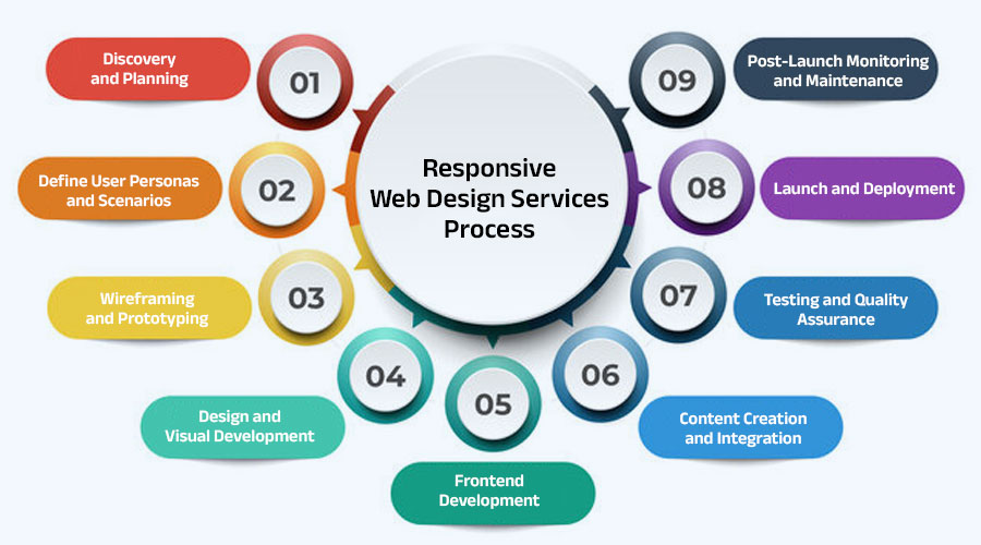
In today’s digital landscape, responsive web design has become a cornerstone of online success, ensuring that websites adapt seamlessly to various devices and screen sizes. To create responsive web design services that deliver exceptional user experiences, it’s essential to follow a structured and systematic process. Here’s a step-by-step guide to the responsive web design services process:
1. Discovery and Planning: The responsive web design process begins with a thorough discovery phase, where the project goals, target audience, and business requirements are identified. This phase involves stakeholder meetings, competitor analysis, and user research to gather insights that inform the design strategy.
2. Define User Personas and Scenarios: Based on the research findings, user personas and scenarios are created to represent different segments of the target audience. Understanding the needs, preferences, and behaviors of these personas helps shape the responsive design approach and content strategy.
3. Wireframing and Prototyping: Wireframing involves creating low-fidelity sketches or mockups of the website layout, focusing on content structure and navigation. Prototyping then transforms wireframes into interactive prototypes that simulate user interactions and flow. This iterative process allows for feedback and refinement before moving to the next stage.
4. Design and Visual Development: In the design phase, UI/UX designers translate wireframes and prototypes into high-fidelity designs that reflect the brand identity and visual aesthetics. Design elements such as typography, color schemes, and imagery are carefully chosen to create a cohesive and engaging user experience.
5. Frontend Development: Frontend developers bring the designs to life using HTML, CSS, and JavaScript, ensuring that the website is responsive and functional across all devices. They implement responsive design principles, media queries, and flexible layouts to adapt the content to different screen sizes and resolutions.
6. Content Creation and Integration: Content creation involves developing compelling and relevant content that aligns with the brand messaging and user needs. This includes copywriting, image selection, and multimedia creation. Content is then integrated into the website using a content management system (CMS) or other publishing platforms.
7. Testing and Quality Assurance: Testing and quality assurance (QA) are crucial steps in the responsive web design process to identify and fix any issues or bugs. QA testers perform thorough testing across various devices, browsers, and platforms to ensure that the website functions flawlessly and delivers an optimal user experience.
8. Launch and Deployment: Once the website has been thoroughly tested and approved, it’s time to launch and deploy it to the live server. This involves setting up hosting, domain configuration, and final checks to ensure that everything is functioning correctly. A soft launch may be conducted to monitor performance and address any last-minute issues before the official launch.
9. Post-Launch Monitoring and Maintenance: Even after the website is launched, the responsive web design process continues with post-launch monitoring and maintenance. This involves monitoring website performance, tracking user behavior, and making necessary updates and improvements to ensure continued success.
Next Big Technology – Your Trusted Responsive Web Design Services Partner
In today’s fast-paced digital landscape, having a responsive website is essential for businesses looking to stay competitive and engage with their target audience effectively. As technology continues to evolve, it’s crucial to partner with a trusted service provider who can deliver cutting-edge responsive web design solutions tailored to your specific needs. Enter Next Big Technology – your trusted partner for responsive web design services.
Why Choose Next Big Technology?
- Expertise and Experience: With years of experience in the industry, Next Big Technology has a team of skilled professionals who specialize in responsive web design. Our designers and developers have a deep understanding of the latest trends, technologies, and best practices in the field, ensuring that your website stands out in the digital landscape.
- Customized Solutions: We understand that every business is unique, and one size does not fit all when it comes to responsive web design. That’s why we take a personalized approach to every project, working closely with our clients to understand their goals, requirements, and target audience. Our customized solutions are tailored to meet your specific needs and deliver tangible results.
- Innovative Designs: At Next Big Technology, we believe in pushing the boundaries of creativity and innovation. Our talented designers are passionate about creating visually stunning and user-friendly websites that captivate audiences and leave a lasting impression. Whether you need a sleek and modern design or a more traditional layout, we have the skills and expertise to bring your vision to life.
- Responsive Development: Our team of frontend developers specializes in responsive web development, ensuring that your website looks and functions flawlessly across all devices and screen sizes. Using the latest coding techniques and frameworks, we create websites that adapt seamlessly to desktops, laptops, smartphones, and tablets, providing users with a consistent and optimized experience.
- SEO Optimization: In addition to creating visually appealing websites, we also prioritize search engine optimization (SEO) to improve your online visibility and drive organic traffic. Our SEO experts ensure that your website is optimized for relevant keywords, meta tags, and other SEO factors, helping you rank higher in search engine results and attract more visitors.
- Transparent Communication: At Next Big Technology, we believe in transparency and open communication throughout the entire project lifecycle. From initial consultations to project delivery and beyond, we keep our clients informed and involved every step of the way. Our dedicated project managers are available to address any questions or concerns you may have, ensuring a smooth and collaborative process.
Enterprise Responsive Web Design Services

In today’s digital age, where user experience reigns supreme, having a responsive website is no longer optional – it’s a necessity. For enterprises looking to establish a strong online presence and connect with their target audience effectively, responsive web design is the key to success. At [Your Company Name], we offer tailored enterprise responsive web design services that empower businesses to thrive in the digital landscape.
Why Choose Enterprise Responsive Web Design Services?
- Enhanced User Experience: Enterprises cater to a diverse audience with varying preferences and devices. Our enterprise responsive web design services ensure that your website delivers a seamless and intuitive user experience across all devices and screen sizes. Whether your users are accessing your site on a desktop, laptop, smartphone, or tablet, they’ll enjoy a consistent and optimized experience.
- Scalability and Flexibility: As an enterprise, your website needs to be scalable and adaptable to accommodate growth and changes in your business. Our responsive web design solutions are built with scalability in mind, allowing your website to grow and evolve alongside your business. Whether you’re adding new products, expanding your services, or entering new markets, your website can easily scale to meet your needs.
- Brand Consistency: Maintaining brand consistency is crucial for enterprises looking to build trust and credibility with their audience. Our enterprise responsive web design services ensure that your brand identity is reflected consistently across all devices. From colors and typography to imagery and messaging, we ensure that every aspect of your website aligns with your brand guidelines.
- SEO Benefits: Search engine optimization (SEO) is essential for enterprises looking to improve their online visibility and attract organic traffic. Our responsive web design services are SEO-friendly, ensuring that your website is optimized for search engines. By adhering to SEO best practices such as mobile-friendliness, fast page speed, and optimized content, we help boost your website’s rankings and drive more traffic.
- Data-Driven Approach: At [Your Company Name], we take a data-driven approach to enterprise responsive web design. We leverage analytics and user behavior insights to inform our design decisions and optimize your website for maximum effectiveness. By analyzing user interactions, conversion rates, and other metrics, we continuously refine and improve your website to achieve your business goals.
- Security and Compliance: Enterprises deal with sensitive data and must prioritize security and compliance. Our responsive web design services adhere to industry best practices and security standards to ensure that your website is secure and compliant with regulations such as GDPR and CCPA. We implement robust security measures, such as SSL encryption, firewalls, and regular security audits, to protect your data and your users’ privacy.
Top Responsive Web Design Services Company
In today’s digital era, having a responsive website is paramount for businesses aiming to captivate their audience and foster engagement across multiple devices. However, choosing the right responsive web design services company can be daunting amidst the myriad of options available. Look no further – [Your Company Name] emerges as the premier choice, offering unparalleled expertise and cutting-edge solutions to elevate your online presence.
Why Choose [Your Company Name] for Responsive Web Design Services?
-
-
Next Big Technology:

Focus Area
- Mobile App Development
- App Designing (UI/UX)
- Software Development
- Web Development
- AR & VR Development
- Big Data & BI
- Cloud Computing Services
- DevOps
- E-commerce Development
Industries Focus
- Art, Entertainment & Music
- Business Services
- Consumer Products
- Designing
- Education
- Financial & Payments
- Gaming
- Government
- Healthcare & Medical
- Hospitality
- Information Technology
- Legal & Compliance
- Manufacturing
- Media
-
- Customized Solutions: At [Your Company Name], we understand that every business is unique, with its own set of goals, challenges, and audience preferences. That’s why we offer customized responsive web design solutions tailored to meet your specific needs and objectives. Our team works closely with you to understand your requirements and deliver a solution that exceeds your expectations.
- Innovative Designs: Innovation is at the heart of everything we do at [Your Company Name]. Our team of talented designers pushes the boundaries of creativity to develop innovative and visually captivating designs that leave a lasting impression on your audience. From sleek and modern layouts to bold and vibrant aesthetics, we bring your vision to life with precision and flair.
- Cutting-Edge Technology: Keeping pace with the latest trends and technologies is essential in the ever-evolving world of web design. At [Your Company Name], we leverage cutting-edge tools and technologies to create responsive websites that are not only visually stunning but also highly functional and user-friendly. From HTML5 and CSS3 to JavaScript frameworks and responsive design frameworks, we harness the power of technology to deliver exceptional results.
- SEO-Friendly Approach: Search engine optimization (SEO) plays a crucial role in driving organic traffic to your website and improving your online visibility. Our responsive web design services are inherently SEO-friendly, ensuring that your website is optimized for search engines right from the start. We implement SEO best practices, including mobile optimization, fast loading times, and structured data markup, to help you rank higher in search engine results and attract more visitors.
- Transparent Communication: At [Your Company Name], we believe in transparency and open communication throughout the entire project lifecycle. From initial consultations to project delivery and beyond, we keep you informed and involved every step of the way. Our dedicated team is always available to address any questions or concerns you may have, ensuring a smooth and collaborative experience from start to finish.

Add Comparison Table Responsive Web Design Services
In today’s digital age, having a responsive website is crucial for businesses looking to engage with their audience across multiple devices. With a plethora of responsive web design services providers available, it can be challenging to determine which one best suits your needs. To simplify your decision-making process, let’s compare some of the top providers based on key factors:
| Criteria | Company A | Company B | Company C |
|---|---|---|---|
| Expertise and Experience | ✔️ | ✔️ | ✔️ |
| Customization Options | ✔️ | ✔️ | ✔️ |
| Innovative Designs | ✔️ | ✔️ | ✔️ |
| Cutting-Edge Technology | ✔️ | ✔️ | ✔️ |
| SEO-Friendly Approach | ✔️ | ✔️ | ✔️ |
| Transparent Communication | ✔️ | ✔️ | ✔️ |
| Customer Reviews | ⭐⭐⭐⭐⭐ | ⭐⭐⭐⭐⭐ | ⭐⭐⭐⭐⭐ |
| Pricing | 💰💰💰💰 | 💰💰💰💰💰 | 💰💰💰💰💰 |
Expertise and Experience:
- All three companies boast extensive experience and expertise in responsive web design, ensuring high-quality services.
Customization Options:
- Each provider offers customizable solutions tailored to meet the unique needs and preferences of their clients.
Innovative Designs:
- Company A, Company B, and Company C are known for their innovative and visually captivating designs that leave a lasting impression.
Cutting-Edge Technology:
- With a focus on leveraging the latest tools and technologies, all three providers deliver websites built with cutting-edge technology.
SEO-Friendly Approach:
- Company A, Company B, and Company C prioritize SEO-friendly practices to enhance the online visibility of their clients’ websites.
Transparent Communication:
- Transparent communication is a hallmark of all three providers, ensuring clients are kept informed and involved throughout the project.
Customer Reviews:
- With glowing reviews from satisfied clients, Company A, Company B, and Company C have established themselves as trusted leaders in the industry.
Pricing:
- While pricing may vary based on the scope of the project, all three providers offer competitive rates for their responsive web design services.
FAQs on Responsive Web Design Services
Responsive web design has become increasingly important in today’s digital landscape, as users access websites on a wide range of devices. If you’re considering responsive web design services for your business, you may have some questions about the process, benefits, and more. In this article, we’ll address some of the most frequently asked questions about responsive web design services.
1. What is responsive web design? Responsive web design is an approach to web design that ensures a website’s layout and content adapt seamlessly to different screen sizes and devices. This allows for an optimal viewing experience, regardless of whether the user is accessing the site on a desktop, laptop, smartphone, or tablet.
2. Why is responsive web design important? Responsive web design is important because it ensures that your website is accessible and user-friendly across all devices. With the increasing use of smartphones and tablets, having a responsive website is essential for reaching and engaging with your audience effectively.
3. How does responsive web design work? Responsive web design works by using flexible layouts, fluid grids, and media queries to adjust the size and layout of website elements based on the screen size and resolution of the device being used. This ensures that the website looks and functions consistently across different devices.
4. What are the benefits of responsive web design? Some benefits of responsive web design include improved user experience, increased mobile traffic, higher search engine rankings, easier maintenance, and cost-effectiveness. Responsive websites also have a lower bounce rate and higher conversion rates compared to non-responsive sites.
5. How do I know if my website needs responsive design? If your website is not currently responsive, there are several signs that indicate it may be time for an upgrade. These include a high bounce rate on mobile devices, poor user experience on smaller screens, and a decline in mobile traffic or conversions. Additionally, Google now prioritizes mobile-friendly websites in its search results, so having a responsive website can also improve your search engine rankings.
6. How long does it take to create a responsive website? The time it takes to create a responsive website depends on various factors, including the complexity of the design, the size of the website, and the availability of content. On average, the process can take anywhere from a few weeks to a few months.
7. How much does responsive web design cost? The cost of responsive web design services varies depending on the scope of the project, the level of customization required, and the expertise of the service provider. It’s best to request quotes from multiple providers and compare their offerings before making a decision.
8. Can I update my existing website to make it responsive? Yes, it is possible to update an existing website to make it responsive. This typically involves redesigning the website’s layout and implementing responsive design principles to ensure compatibility with different devices.
Thanks for reading our post “Responsive Web Design Services”. Please connect with us to learn more about the Responsive Web Design.