
To make a website that works well on all devices and ranks high on Google, you need to know about responsive web design and SEO. A website that focuses on mobile users can really boost your ranking and bring more visitors. By using responsive design and SEO, you can get more people to see your site. For top-notch help with responsive web design, check out responsive web design services that make your site look great and easy to use.
Table of Contents
Key Takeaways
- Responsive web design is key for better ranking and user experience.
- Starting with a mobile-first design is important for responsiveness.
- SEO techniques can greatly improve your site’s ranking and traffic.
- A well-made website can make you more visible online and reach more people.
- Getting help from expert responsive web design services can make your site stunning and user-friendly.
- Understanding Google’s algorithms and focusing on responsive, user-friendly sites is crucial for success online.
- By using responsive design and SEO, you can stay ahead and meet your online goals.
Understanding Responsive Web Design Fundamentals
Responsive web design makes websites work well on all devices, from big computers to small phones. It focuses on mobile-first design, making sure content is easy to see on smaller screens. This way, websites are easy to use on any device.
A good responsive website gives a smooth user experience like websites that are easy to use.
What Makes a Website Responsive
A responsive website changes to fit different screens and devices. Key features include:
- Flexible grids and layouts
- Responsive images and media
- Prioritized content for smaller screens
Key Components of Mobile-First Design
Mobile-first design starts with designing for small screens and then goes up to bigger ones. This makes websites better for mobile use. It helps improve user experience and search rankings.
Importance of User Experience in Rankings
A good user experience helps websites rank higher. Websites that are easy to use, load fast, and have useful content rank better. By focusing on mobile-first design and user experience, websites can get more visitors.
Essential Tools and Technologies for Responsive Development
Building a responsive website needs the right tools and technologies. Developers use responsive development tools to make websites fit different screens and devices. Key tools include CSS frameworks like Bootstrap, front-end build tools, and CMS that support responsive design.
There are many web technologies to choose from. HTML5 and CSS3 are great for building responsive sites. JavaScript libraries like jQuery add interactivity and improve user experience.

Using responsive development tools offers many benefits. It improves user experience, boosts mobile traffic, and helps with search engine rankings. With these tools, developers can make websites that work well on all devices, offering a better user experience.
- CSS frameworks like Bootstrap
- Front-end build tools
- Content management systems (CMS) that support responsive design
In conclusion, web technologies are key for responsive websites. The right tools and technologies help developers make websites that work on all devices. This leads to a better user experience and higher search engine rankings.
Mobile-First Design Principles and Implementation
Creating a responsive website starts with mobile-first principles. This means designing for the smallest screen first. Then, you move up to bigger screens. This way, your website works well on all devices, like smartphones and tablets.
Mobile-first design uses flexible grids to adjust to different screen sizes. This keeps your content clear and organized. Also, responsive images are key for a smooth user experience on all devices. They make sure images fit perfectly, no matter the screen size.
Important things to think about in mobile-first design include:
- Using flexible grids for a responsive layout
- Optimizing images for various screen sizes
- Ensuring typography scales well across devices
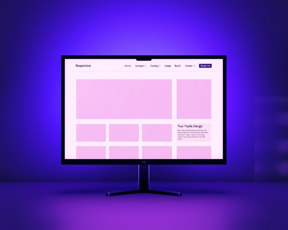
By sticking to these mobile-first principles, you make your website better for all devices. This improves user experience and boosts your search engine rankings. A well-designed mobile-first website greatly enhances user engagement, as shown in the image below.

By focusing on mobile-first design, with flexible grids and responsive images, your website becomes more user-friendly and search engine-friendly. This leads to more traffic and conversions for your site.
How to Build a Responsive Website That Ranks Higher on Google: Step-by-Step Guide
To make a responsive website that Google loves, start with a plan. Think about how users will experience your site and how it will rank on Google. A good plan is key to a successful responsive website.
Then, design your site with mobile users in mind. Use flexible grids and layouts. This makes sure your site looks good on all devices. After that, build your site with HTML, CSS, and JavaScript. Make sure it works well and is easy to use.
Here are some important steps:
- Plan your website’s structure and content
- Design your website with a mobile-first approach
- Develop your website using HTML, CSS, and JavaScript
- Test your website for usability and performance

By following these steps, you can make a responsive website. This will help your site rank better on Google and give your visitors a great experience. Always work on making your site faster and more user-friendly. Test it often to keep it responsive and easy to use.
| Step | Description |
|---|---|
| 1 | Plan your website’s structure and content |
| 2 | Design your website with a mobile-first approach |
| 3 | Develop your website using HTML, CSS, and JavaScript |
| 4 | Test your website for usability and performance |
Optimizing Site Speed and Performance
Site speed is key for a good user experience and better search engine rankings. A slow site can cause people to leave quickly, leading to low engagement and poor sales. To make your site faster, focus on site speed optimization methods.
One top way to speed up your site is through image optimization. This means compressing images and using lazy loading. Lazy loading loads images only when they’re needed.
Another important step is browser caching. It cuts down on server requests, making pages load faster. Also, minifying CSS and JavaScript files can make your site load quicker by reducing file sizes.

- Optimize images by compressing and resizing them
- Use lazy loading to load images only when they come into view
- Leverage browser caching to reduce server requests
- Minify CSS and JavaScript files to reduce file size
By using these site speed tips, you can make your website much faster. This will lead to happier users and better rankings on search engines. Always check your site’s speed and performance to find ways to make it even better.
Implementing Responsive Navigation Systems
Responsive navigation is key for a smooth user experience. A good navigation system lets users find what they need, no matter the device. It’s crucial to have mobile-friendly menus that fit different screen sizes.
Flexible and adaptable menus are essential for responsive navigation. This includes hamburger menus and accordion menus. These features make navigation easy and intuitive.

- Use clear and simple labels.
- Keep menu options to a minimum.
- Use dropdown menus and submenus.
- Make sure menus work on all devices.
By following these tips, developers can make websites that are easy to use. This ensures a great experience for everyone.
Content Strategy for Mobile Users
A successful online presence needs a good content strategy. This is especially true for mobile users. They need content that’s easy to read on small screens.
To make content better for mobile, consider a few tips. Use short paragraphs and simple language. Also, add links to help with mobile-friendly content.
Some important points for mobile content include:
- Write clearly for mobile readers.
- Organize content in a way that works on small screens.
- Use tips like short paragraphs and bullet points.
By focusing on these, you can make your content more engaging for mobile users. Content is king. Prioritizing mobile content can boost your online presence and reach more people.

A good content strategy for mobile users is key in today’s digital world. By focusing on mobile content and using the right formatting, you can create a more effective online presence. This will help you achieve your goals.
Technical SEO Considerations for Responsive Sites
Building a responsive website means you must think about technical SEO. Technical SEO is key to getting your site seen more by search engines. For responsive sites, it’s important to work on SEO considerations like meta tags, header tags, and internal links.
A site with good technical SEO looks better and is easier to use. Important SEO considerations for responsive sites include:
- Optimizing images and media to reduce page load times
- Using header tags (H1, H2, H3, etc.) to structure your content
- Implementing internal linking to help search engines understand your site’s hierarchy
Adding these technical SEO elements can boost your responsive site’s ranking. This means more people will visit your site. Always think about your audience and make your site easy to use.

By following these SEO considerations and focusing on technical SEO, you can make a responsive site that looks great and ranks well. This will bring more visitors and help your site grow.
Core Web Vitals Optimization
Improving core web vitals is key for a better user experience and better search rankings. These include Largest Contentful Paint (LCP), First Input Delay (FID), and Cumulative Layout Shift (CLS). To boost LCP, make sure the main content loads fast, ideally in 2.5 seconds.
Optimizing images, minifying CSS and JavaScript, and using browser caching help a lot. Also, reducing FID is crucial for a smooth user experience. This can be done by splitting big JavaScript files, using code splitting, and cutting down on third-party scripts.

Minimizing CLS is also important for a good user experience. Use a consistent layout, avoid dynamic content, and make sure ads and media are the right size. By focusing on these core web vitals, developers can make their websites faster and more user-friendly. This leads to better search rankings and more user engagement.
Key Optimization Strategies
- Optimize images to reduce LCP
- Minify and compress files to reduce FID
- Use a consistent layout to minimize CLS
By using these strategies, developers can make their websites fast, smooth, and engaging. This leads to better search rankings and more conversions.
| Core Web Vital | Optimization Strategy |
|---|---|
| LCP | Optimize images, minify CSS and JavaScript |
| FID | Break down large JavaScript files, use code splitting |
| CLS | Use a consistent layout, avoid dynamically loaded content |
Making Your Website Accessible Across All Devices
Ensuring website accessibility is key for everyone to use your site. It’s about making sure your site works well on all devices. This includes cross-device compatibility, so users can visit your site on phones, tablets, and computers.
To make your site accessible, follow these tips:
- Choose colors and fonts that are easy for everyone to read.
- Use a navigation system that changes size based on the screen.
- Make sure your content is easy to find and use on all devices.
A website that works well on all devices and is accessible to all can greatly improve user experience. By focusing on accessibility, you make your site better for more people. This means more people can use your site, no matter their abilities or what device they’re using.
- Provide text for images so everyone can understand them.
- Keep your navigation clear and consistent.
- Make sure your site can be used with just a keyboard.
By adding these features and focusing on cross-device compatibility and website accessibility, you can make your site better for everyone. This will improve their experience and make your site more effective.
Testing Your Responsive Design
It’s important to make sure your website works well on different devices and browsers. This is why responsive design testing is key. It helps you find and fix problems that could affect how users see your site and how search engines rank it.
To begin, you need to do cross-browser testing. This ensures your site works right on various browsers and devices. You can test it on desktops, laptops, tablets, and phones. Tools like BrowserStack or CrossBrowserTesting can help with this.
Also, performance testing is vital. It checks how fast your site loads, how well it responds, and its overall performance. Google PageSpeed Insights or GTmetrix can help spot areas to improve and make your site faster.
Some important things to check during responsive design testing are:
- Layout and design consistency across devices
- Image and media responsiveness
- Typography and font sizes
- Navigation and user interface
By focusing on responsive design testing, cross-browser testing, and performance testing, you can make sure your website is top-notch. This will also help your site rank better in search engines.
Common Responsive Design Mistakes to Avoid
Creating a responsive website means avoiding common mistakes. These mistakes can hurt user experience and search rankings. One big error is using fixed widths, which can mess up responsive design on various devices. Another mistake is not optimizing images, causing slow loading times and a bad user experience.
Avoiding common errors in responsive design needs careful planning and testing. Some key mistakes to watch out for include:
- Not testing on real devices
- Not optimizing content for mobile users
- Using too many graphics and heavy elements
Knowing these common responsive design mistakes helps developers make better websites. These websites offer a better user experience and improve search rankings. As responsive design keeps evolving, staying updated with best practices is key.
By following best practices and avoiding common mistakes, developers can make websites that are both user-friendly and search engine optimized. This leads to a better online experience for everyone.
Measuring Success Through Analytics
To see if a website is working well, we need to use analytics tools. These tools help us track important things like how users behave and how many convert. By looking at these numbers, we can find out what needs to get better and make smart choices to improve our site.
Some key things to watch include:
- Page views and unique visitors
- Bounce rate and average session duration
- Conversion rates and revenue generated
Key Performance Indicators
KPIs are numbers that show how well a website is doing. They can be things like how fast the site loads, how it looks on mobile, and how engaged users are. By keeping an eye on these KPIs, we can spot trends and make our site better.
User Behavior Metrics
It’s important to know how users act on our website. Metrics like click-through rates and scroll depth tell us a lot about how users interact with our site. By looking at these, we can see where we can make our site better and improve the user experience.
| Metric | Description |
|---|---|
| Click-through rate | The percentage of users who click on a link or call-to-action |
| Scroll depth | The percentage of users who scroll to a certain point on the page |
Maintaining Your Responsive Website
A responsive website needs constant website maintenance to work well and offer a great user experience. This means doing updates to fix bugs, make it better, and keep it safe. Regular security checks help protect your site from threats and keep your users’ data safe.
Some important parts of website upkeep include:
- Regular software updates to prevent vulnerabilities
- Performance monitoring to ensure fast loading speeds
- Security checks to protect against malware and other threats
By focusing on security and doing regular updates, your responsive website stays safe, fast, and easy to use. This can also help your site rank better on search engines and give your users a better experience.
Conclusion
Creating a website that ranks well on Google needs a good grasp of responsive web design and SEO. These elements help make your site easy to use and boost your search rankings.
A responsive website is key in today’s mobile world. It makes sure your site looks and works well on all devices. This improves user experience and helps your site rank higher on Google. By using the tips from this article, you can make a site that looks good and works well, leading to better SEO.
To sum up, responsive design and SEO are vital for a successful website. By applying these principles, your site can stand out and rank higher on Google. This brings more visitors and helps your site grow.