
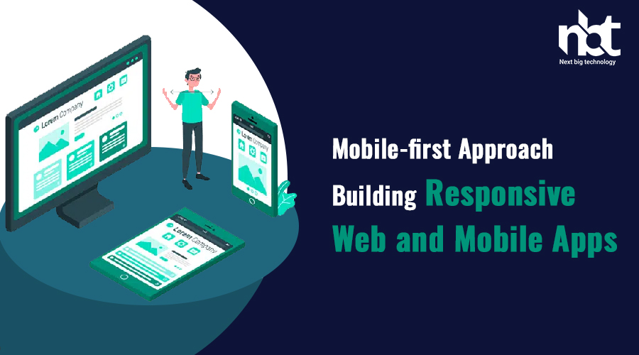
Table of Contents
1. Understanding the Mobile-First Approach
The mobile-first approach is a design and development strategy that prioritizes the creation of web content and applications for mobile devices before adapting them to larger screens, such as desktops or tablets. This approach recognizes the dominant role that mobile devices play in today’s digital landscape.
2. The Significance of Mobile-First Design

In an era where mobile devices are the primary means of accessing the internet, adopting a mobile-first approach is paramount. Mobile users demand fast-loading, user-friendly experiences, and businesses that fail to meet these expectations risk losing valuable customers.
3. Responsive Design vs. Mobile-First Design
While responsive design aims to adapt content to various screen sizes, mobile-first design starts with the smallest screen and progressively enhances it for larger screens. Mobile-first design ensures that even on smaller screens, users get the best experience possible.
4. Key Principles of Mobile-First Design
Content Prioritization
Prioritize essential content and features for mobile users. Ensure that what matters most is accessible quickly and efficiently.
Progressive Enhancement
Build upon the mobile foundation to add features and functionality for larger screens. This approach ensures that users on all devices enjoy a consistent and enhanced experience.
Performance Optimization
Optimize performance by minimizing unnecessary assets and focusing on speed. Faster loading times lead to higher user satisfaction.
5. Adaptive vs. Responsive Web Design

While responsive design aims to adapt content to various screen sizes, adaptive design creates distinct layouts for specific devices. Choosing between the two depends on your project’s requirements and user base.
6. Tools and Technologies for Mobile-First Development
Explore a range of tools and technologies, including responsive frameworks, CSS media queries, and mobile app development platforms, to facilitate your mobile-first approach.
7. Building Mobile-First Websites
Choosing the Right Framework
Select a responsive framework like Bootstrap or Foundation to kickstart your mobile-first website. These frameworks streamline the development process and ensure compatibility across devices.
Optimizing Images and Media
Compress images and optimize media files to reduce load times. Balancing quality and performance is essential.
Prioritizing User Experience
A seamless user experience should be the core focus of your mobile-first website. Ensure that navigation is intuitive, and interactions are effortless.
8. Mobile-First App Development

Selecting the Right Development Platform
Choose between native, hybrid, or progressive web apps (PWAs) based on your project goals. Each has its advantages and limitations.
User Interface and User Experience (UI/UX)
Craft an intuitive and visually appealing UI/UX design to engage users and keep them coming back.
Cross-Platform Compatibility
Consider building apps that work seamlessly across different operating systems, ensuring a broader reach.
9. Testing and Debugging
Thoroughly test your mobile-first web or app project across various devices and browsers. Identify and fix any issues to deliver a flawless user experience.
10. Optimizing for Speed and Performance
Keep a keen eye on performance metrics and continually optimize your project to ensure fast loading times.
11. SEO Considerations in Mobile-First Development
Implement mobile SEO best practices, such as mobile-friendly design, fast-loading pages, and structured data, to boost your website’s search engine rankings.
12. User Feedback and Iteration
Collect user feedback and make iterative improvements to your mobile-first project. User input is invaluable for enhancing the user experience.
13. Security in Mobile-First Development

Prioritize security measures to protect user data and maintain user trust in your mobile-first applications.
14. Future Trends in Mobile-First Design
Stay updated on emerging technologies and design trends to remain competitive in the mobile-first landscape.
15. Conclusion
Embracing a mobile-first approach in web and app development is no longer optional—it’s imperative for success in the digital age. By following the principles outlined in this article and staying attuned to user needs and industry trends, you can create exceptional mobile experiences that drive engagement and growth.
Thanks for reading our post “Mobile-first Approach: Building Responsive Web and Mobile Apps”. Please connect with us to know more about Building Responsive Web and Mobile Apps.