


Dark themes have become increasingly popular in app design over the past few years. Apple added Dark Mode to macOS earlier this year, and at Google’s I/O 2019 Conference, the company said that everyone would be able to use Dark Theme. Dark themes are all the rage when it comes to the latest fashions.
Dark themes can be compelling if they are done well. They make it easier to read in dim light. Eases strain on the eyes. With the proper display, they can cut power use by a considerable amount.
The creator of an app needs to have the Dark Theme ready. But making a dark theme that looks good isn’t a walk in the park. It’s not enough to use the same colors or change the tones. If you go that way, you’ll end up with the exact opposite of what you want.
Table of Contents
Why should you choose the Nighttime Mode?
This article will discuss how to make a dark theme for your app. But first, it’s essential to know why dark mode is there:
What’s Hot Right Now
A “dark mode” has been one of the most modern design features of the past year. Growth is steady and based on what the market needs.
Makes batteries last longer.
Apps that have a “dark mode” help save battery life. Google confirmed that the dark mode on OLED screens saves a lot of battery life.
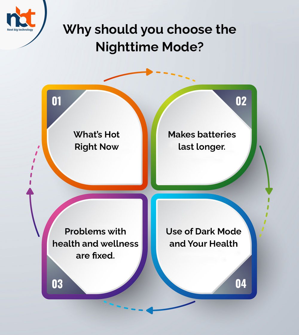
Problems with health and wellness are fixed.
If you use apps with too much brightness for a long time, it could hurt your eyes. The good things about the dark theme are now clear. Using it in the dark gives your eyes a break so you can read and use your devices without straining them. This can help with several health problems.
Also read : The Ultimate Guide to Create a Design Concept
Use of Dark Mode and Your Health
When you read white Text on a black background, the iris dilates to let in more light, which puts stress on the eye. Lens distortion also makes it harder to see. Finally, the Fuzzing Effect, also called Halation, makes it hard to make apps that work well in dark mode.
The unhealthy dark mode is hard on the eyes because it has a lot of contrast, which is what the name suggests. If you’ve ever tried to read a whole document on your computer or phone when it was set to the darkest setting, you know how hard it is.
In iOS 13, what changes did Apple make to the Dark Theme?
Apple has put iOS’s color scheme and user interface design back in the spotlight by adding a “dark mode.” Let’s look at the changes Apple made to iOS 13 to help make dark mode possible:
System of Colors
Apple has given the operating system nine colors by default, and all of them go well with the dark theme and movement of the system as a whole. Because of this, these colors can be changed to fit different user interface designs.
What Each Color Means
Apple has added meaningful colors to commonly used UI elements to make iOS apps look and feel the same in light and dark modes.
These colors don’t have the correct RGB value, and they change how the iOS user interface looks without you having to do anything else. Also, these colors help you deal with the color of the overlay and the Text in the dark mode.
SF Symbols
As part of the Human Interface Guidelines, Apple gives app designers and developers about 1500 SF symbols to use in their apps. However, because they were made to work well with dark and light UI, they look great in Dark Mode by default.
What Blurring and Vibrancy Do to Sound
With iOS 13, Apple added eight vibrancy effects and four blur effects. These effects automatically fit the style of the iOS interface. Apple has also added four new vibrancy effects to the dark iOS mode typographic suit: one for the divider and three for the overlay.
How to Use a Dark Theme in the Design of Your Mobile App
Google and Apple have put their dark mode design guidelines at the top of their lists to give you a better user interface (UI) experience. But as we’ve seen, the experience might be worse if the dark mode design theme isn’t considered.
Avoid colors that are too bright.
Even though saturated colors look great on white backgrounds, they might seem to jump out of dark backgrounds, making it harder to read Text. So, the primary colors should be less bright to stand out more against the dark surface.
Make far-away backgrounds darker.
Background colors for UI elements with dark themes usually follow this rule: the lighter the surface area, the closer it is to the user. In this picture, the atmosphere is like a light shining down from above. The farther away something is, the less light it gets. This makes it look darker and more hidden.
Cut down on the number of solid areas of color.
Big blocks of color are sometimes used to highlight good ideas. In the big picture, this is fine, but the lights on our most important machines are about to get brighter.
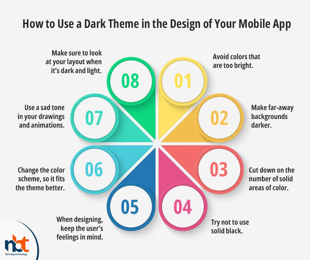
Try not to use solid black.
The dark theme of your app shouldn’t just be black Text on a white background. It can be hard to move around on screens with a lot of contrast.
When designing, keep the user’s feelings in mind.
When designing the dark theme for your current app, you’ll likely want to show the same range of emotions as you did in the light mode. But it would help if you didn’t do that because how people see colors changes significantly depending on where they are.
Change the color scheme, so it fits the theme better.
When you make your Text less bright to avoid headaches, and eye strain, the colors of your buttons and accents may look too bright. You will need to make some changes to these colors to look good and are still easy to read at night. First, turn down the brightness so that these colors don’t make the words hard to read. Then, turn up the saturation until they look like something.
Also read : 10 Mobile UX Design Practices to Delight Your Users
Use a sad tone in your drawings and animations.
If your app has a lot of animations and other visual elements, you should be ready for them to work with the dark theme.

Make sure to look at your layout when it’s dark and light.
Make any changes to ensure that your UI looks good in both themes. Then, test your product under bright lights as the sun starts to go down.
Let them choose whether to use the dark theme or not.
It’s incredible that the system can decide when to use the dark theme and when to use the light theme, right? This choice, on the other hand, could hurt the user’s experience as a whole. After all, this lets you control the users and gives the program complete control over what they do.
In conclusion, dark themes are used more and more often because they have many benefits. However, even though they are helpful, they are hard to use well. Inverting shades and reusing colors is a quick and dirty solution, but it can cause severe problems with readability, data integrity, and visual hierarchy.
Now that you know everything you need to know to add a dark mode to your mobile app, you should get in touch with a UI/UX design team with a lot of experience. You need to look into this to get closer to your goal of giving customers a good experience.

Thanks for reading our post “The Best Practices to Design Dark Mode for Mobile Apps in 2022”, please connect with us for any further inquiry. We are Next Big Technology, a leading web & Mobile Application Development Company. We build high-quality applications to full fill all your business needs