

Responsive web design is a way to make a website usable and accessible on a wide range of devices, no matter how big or small their screens are or what they show. In its simplest form, a responsive website will change its text size and other features to look good on any device, such as smartphones, tablets, desktop computers, and more.
With a responsive, mobile-friendly online storefront, business owners can connect with a much larger audience and, in the end, make more money. To fully understand responsive web development, you should know the difference between responsive and adaptive design.
Table of Contents
If this has gotten your attention, here are 5 responsive web design examples to keep you interested.
Why responsive web design is so important.
Websites that do well today know how important responsive design is for getting and keeping visitors. Let’s look at some of the reasons why this is happening.
At first, the shift to focusing on mobile devices.
We started by saying that over 4 billion people worldwide now buy things online with their phones. Online stores must recognize the growing number of customers who use mobile devices to shop on their sites.
Mobile-first website design has become a good way to reach more people and increase conversions on mobile devices.
Also read : Importance of responsive web design in the online market
Helpful for SEO (SEO)
A responsive web page automatically changes based on the device used to read it, making it easier to read on more devices.
With a responsive layout, people stay on your site longer, and you can better meet their needs. Those in charge of marketing and promoting a website will like the boost this gives the site’s search engine rankings.
Costs have dropped by a lot.
You won’t have to design, build, develop, and test different website versions for different devices. This will save you and your team time and money.
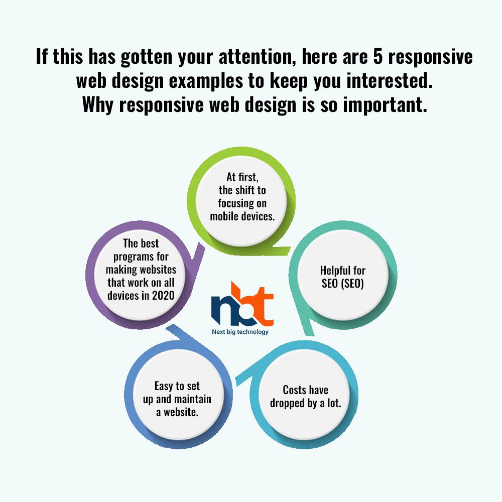
Easy to set up and maintain a website.
So, from now on, you should only build and update one site. Knowing everything is under control, you and your partner will have an easier time with this.
There are a lot of tools that can help you build, test, and maintain a responsive website.
With a prototype tool like Mockplus, you can make responsive elements, layouts, and pages with just a few clicks and test them on different devices in no time. And you can easily share your online prototypes with your whole team, clients, and stakeholders with just one HTML link.
In this article, we’ll talk about the steps you need to take to make a website that works well on mobile devices.
After you understand the basics of responsive web design, the next step is learning how to make a responsive website. We’ve compiled a list of the best free responsive web design tools, video lessons, and other resources to help you make a great responsive website quickly and easily.

The best programs for making websites that work on all devices in 2020
We’ve put the different tools into the following groups to make it easier for you to choose the right one for you:
To make it easier to make responsive web layouts, we offer the following:
Tools for making and testing websites that are mobile-friendly Tools for starting from scratch to make responsive web designs
Website designs and templates that work well on mobile devices can be found here.
Squarespace
If you are building a responsive website but need to learn more about iPhone UI/UX design or coding, an online responsive website builder like Squarespace that lets you make responsive websites on your browsers could be the best tool.
Squarespace makes it easy to start a website by giving you a wide range of templates that professionals have made. You can pick from dozens of professionally made templates with colorful backgrounds, easy-to-use navigation bars, and widgets that you can change.
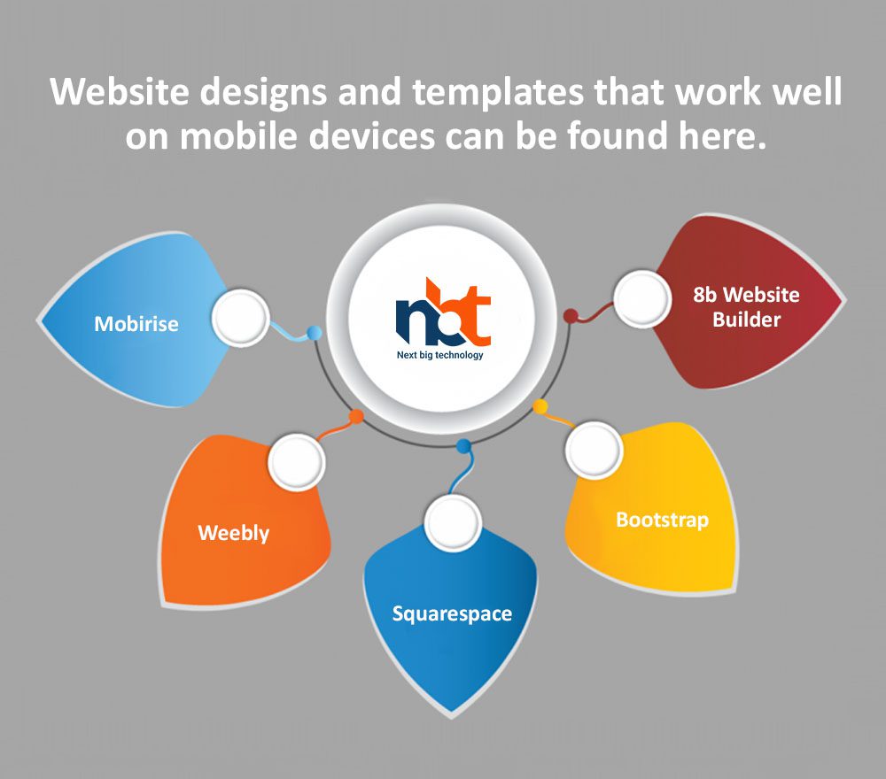
Weebly
Weebly is a free drag-and-drop website builder that runs in the cloud and comes with more than 40 mobile-friendly templates. Weebly is a great option if you don’t want to learn how to code for the web.
Weebly has fewer tools, responsive templates, or features than Squarespace. However, it’s a good choice if you can quickly make a simple responsive design.
You can also save your site’s code in the HTML/CSS format, which is more common.
Mobirise
Mobirise is a free offline tool if you have Windows or a Mac and want to make a beautiful website that works well on phones. You can choose from more than 3,500 building blocks, themes, and themes.
Using Mobirise, drag and drop the block you want onto a page. When you’re done making a website, you can use the buttons in the toolbar at the top to see how it will look on different devices.
This is the best choice if you want to design or build a responsive website but need to learn how to code.
Also read : A Complete Guide to Developing a Responsive Website! Tips & Tricks Highlighted!
8b Website Builder
With 8b Website Builder, you can make a site that works well with search engines like Google and is optimized for mobile devices without spending a dime. More than a million high-quality stock photos, 950 Google fonts, 1,000 web icons, and 250 premade sections and layouts give you endless ways to design your website.
People who want to make responsive websites but need to learn how to code have another good choice. It has many cool features, like unlimited storage space, domains, and PWAs (Progressive Web Apps).
Bootstrap
Most developers worldwide use Bootstrap, the most popular free HTML, CSS, and JS framework, to make websites that work well on mobile devices.
It has a full set of open-source front-end tools, such as responsive grid systems, components, layouts, elements, JavaScript plugins, a CSS front-end framework, and much more. This information will make building responsive websites easier and faster for you.
Thanks for reading our post “5 Best Tools for Responsive Web Designing”, please connect with us for any further inquiry. We are Next Big Technology, a leading web & Mobile Application Development Company. We build high-quality applications to full fill all your business needs.