

With the world slowly recovering from the pandemic’s peak, Search Engine Optimization (SEO) has returned to the table in force. During these challenging times, it has become increasingly local and mobile-centric to account for the changed customer and marketing landscape. Since its latter quality has arguably become more pressing, let us devote this article to exploring some of the best ways to optimize your website for mobile-friendly SEO.
Table of Contents
Why does mobile-friendliness matter for SEO?
First, let us briefly establish why it’s so important a factor. In part, it’s because it’s still one of the most important Google ranking factors, but that’s not all. Its audience still expands rapidly, it has quickly become a Web Vitals staple, and it’s invaluable for small businesses.
#1 Mobile marketing has become invaluable for small businesses
Mobile marketing has become an irreplaceable asset for small businesses the world over. They now need to target phone users effectively for multiple reasons, including:
- The continued dominance of voice search for local searches, which mainly occur on mobile devices
- The prevalence of local SEO itself in turn
- Increasingly fragmented customer journeys, whose touchpoints frequently include mobile devices
Mobile marketing strategies will include voice search optimizations, social media campaigns, mobile apps when applicable, and more. But they all must begin with a mobile-friendly website to help secure conversions.
#2 Mobile-friendliness is part of Web Vitals
Second, as outlined above, mobile-friendliness is a staple of Web Vitals. Google themselves say as much:
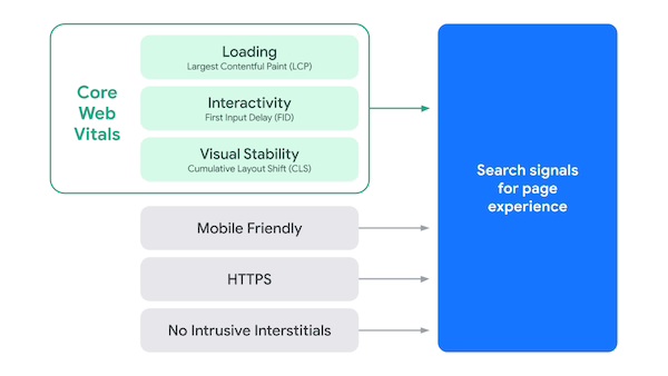
While Core Web Vitals seem to occupy the conversation on SEO, the entirety of Web Vitals remains crucial too. They directly inform Page Experience scores, which in turn affect final rankings in Search Engine Results Pages (SERPs). So even for general SEO, one cannot overlook mobile-friendliness without visible ranking penalties.
#3 Mobile traffic now surpasses desktop traffic
Finally, a key reason why Google insists you optimize your website for mobile-friendly SEO is simply that users need it. Its explicit purpose is to deliver valuable content to its users, after all, and value depends on their devices too. In fact, Statista finds that mobile traffic now surpasses desktop traffic. So it’s not simply a matter of SEO, but also one of final revenue for your business.
Ways to optimize your website for mobile-friendly SEO
With all that in mind, here we’ve collected the five most substantive ways in which you may ensure mobile friendliness.
#1 Adopt a mobile-first design philosophy
First and foremost, web design trends have consistently advocated for mobile-first designs. The principle of this philosophy is simple; mobile websites scale to desktops much easier than vice versa. Mobile devices have far less screen real estate by default, so mobile-first designs cater to it through such qualities as:
- Simple designs for readability, content scannability, and faster loading speeds
- Easier navigation with fewer branching paths to confuse users
- Strong, readable Calls to Action (CTAs) that attract the attention of busy visitors
Such qualities are, of course, universal, so they will benefit all of your users across all devices. It’s thus not prioritizing one user segment over another but satisfying them all at once.
#2 Minimize loading times
Similarly, all users mind slow loading speeds – perhaps even more so post-pandemic. Google/SOASTA research has confirmed this marketing truism, correlating slow speeds with higher bounce rates:
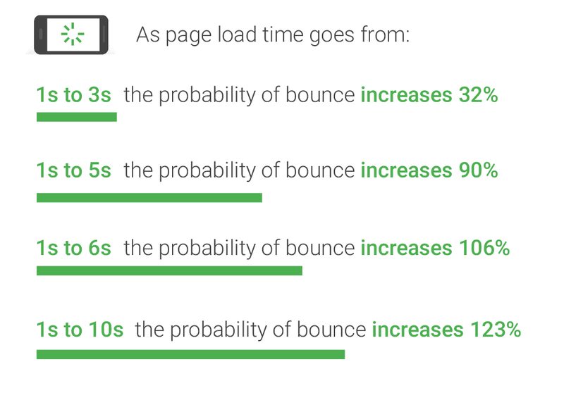
Mobile users are particularly sensitive to them, however. So, trimming down your loading speeds is among the most reliable ways to optimize your website for mobile-friendly SEO. You may do so through such practices as:
- Compressing your images – strive to have file sizes of no more than 100kb.
- Culling heavy themes, plugins, and visuals – examine and remove anything that slows your website down without significant benefits.
- Cleaning up your code – minify your JavaScript wherever appropriate, and try to minimize requests to not clog up your server.
As you do, you may also explore other options like Content Delivery Networks (CDNs) and different hosting providers. Of course, these will largely depend on your unique business needs and budget.
#3 Leverage Google AMP
Should you need more speed, you may also use Google’s Accelerated Mobile Pages (AMP). As the name suggests, this standard caters explicitly to mobile devices and offers excellent perceived loading speeds for your users. As it does, it provides notable perks such as:
- Flexibility – Google AMP can fuel web pages, stories, emails, and more
- Integrations – being Google’s, it offers seamless integrations with Google Search and Analytics
- Monetization – if it doesn’t fuel your content strategies, AMP content may also be monetized by itself
Of course, these notable perks are still somewhat secondary in our context. As its primary function, it offers one of the best ways to optimize your website for mobile-friendly SEO.
#4 Optimize navigation
All visitors value easy website navigation. For them, it offers a better User Experience (UX) and a clearer path to valuable content. For you, it provides more predictable and adjustable customer journeys and better engagement signals to boost your SEO score.
Consider such navigation enhancements as the following:
- Use a drop-down navigation menu to keep navigation on smaller screens simple
- Provide an HTML sitemap in your footer
- Offer breadcrumbs if possible
- Consolidate your website structure, so URLs enhance navigation further
- Strategically link to relevant pages within your content to facilitate customer journeys
As you do, you may use such tools as site heat maps to adjust your course based on user behavior.
#5Mind popups
Finally, on the subject of UX, you may carefully examine your website’s popups. While those can be effective, despite their reputation, they can very easily hamper your visitors’ UX – especially for mobile devices. That’s so notable that Web Vitals explicitly value the lack of “intrusive interstitials” as its own ranking signal if you revisit the image above.
Still, Google doesn’t mind popups; they specifically mind “intrusive” ones that hamper UX. To address this, you may first review how Google defines this term themselves, and then consider their suggestion of banners:
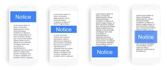
Of course, this may not work for all popups, but it may work for many. For others, you may weigh their potential returns against their potential UX costs and decide on a case-by-case basis.
Google tools to optimize your website for mobile-friendly SEO
Having mentioned and cited Google manifold, let us conclude this article with some of their most valuable resources. Your tools of choice may substitute for the following, of course, but these also happen to be free and distinctly user-friendly.
#1 Information
Knowledge is half the battle, and Google does try to provide ample knowledge for mobile-friendliness in SEO. All the aforecited articles aside, you may also consider looking into:
- Their “getting started” page for mobile sites
- Their mobile statistics and case studies
- The page on Web Vitals
We did use information from all three for this article as well, but here you may browse through the full articles at your leisure.
#2 Google’s mobile-friendliness test
Next, once you’ve made your mobile-friendliness optimizations, you may use Google’s mobile-friendly test tool to gauge their effectiveness. This tool is extremely easy to use; simply enter your website’s URL or specific code. Click “test URL” or “test code” respectively, and you will get a detailed report on how it measures up to Google’s standards – and, more importantly, suggestions on what you may do to optimize it further.
#3 Google Search Console mobile usability report
Finally, in Google Search Console (formerly Webmaster Tools), you may generate mobile usability reports for individual pages. The process is comparatively simple, and reports provide ample actionable data for you to use. To get started, visit their relevant Help Center article.
Conclusion :
To summarize, there are ample ways to optimize your website for mobile-friendly SEO – and equally many reasons to do so. You may begin with adopting a mobile-first design philosophy, leveraging Google AMP, and optimizing your navigation. Then, as regular SEO mandates, you may continue with loading speed optimizations and an examination of your popups. Finally, you may use Google’s resources above or your own third-party solutions to monitor your efforts and adjust accordingly.